Dashboards that help boost sales: Qlik Sense Real Use Cases
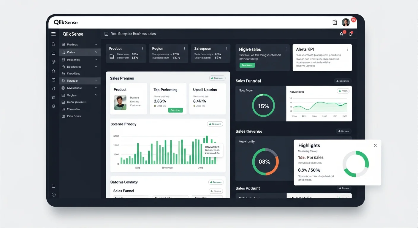
Dashboards Aren't Just Pretty Charts—They Must Actually Drive Sales Many organizations invest in dashboards only to find they're not cost-effective because they start from the wrong place—designing based on attractive charts rather than starting with "business questions that need answers" such as who are the top performers, which products have the highest profit margins, which customer segments have growth potential or are at risk of leaving. Qlik Sense dashboards that actually drive sales must be designed to answer these questions in just a few clicks and enable immediate action. This article will show you real use cases from international businesses, along with dashboard ideas applicable to Thai businesses. 5 Qlik Sense Dashboard Ideas That Directly Increase Sales 1. Sales Performance & Pipeline Dashboard: Track Sales and Opportunities in Real-Time This dashboard is ideal for sales teams and sales managers who need to track performance and identify areas for improvement. Essential KPI Cards: Today's sales, this month's sales compared to targets (Target vs Actual) Growth percentage (Growth %) compared to previous month or year Number of active deals Leaderboard Rankings: Top 10 sales reps, branches, dealers, or regions ranked by sales and margin Leaderboard visualization stimulates team competition Pipeline & Conversion Funnel: Display the sales journey from leads → opportunities → quotes → closed deals to identify bottlenecks where customers drop off, then adjust sales scripts or promotions accordingly. Real-World Use Example: Sales managers open the dashboard every morning to see which sales reps are following up too slowly on pending deals, which major clients are about to fall out of the pipeline, and can direct the team to follow up immediately, reducing revenue loss opportunities. 2. Product & Margin Intelligence Dashboard: Analyze Products and Profitability Intelligently This dashboard is ideal for marketing teams, product managers, and executives who want to optimize sales and profitability. Top/Bottom Products Analysis: High-selling but low-margin products (High Volume, Low Margin) Low-selling but high-margin products (Low Volume, High Margin) This data helps plan promotions, cross-sell, or up-sell for maximum results Price & Discount Analysis: View the relationship between discounts and sales and margin to find the sweet spot—the discount level that actually increases sales, not just eats into profits. Stock & Lost Sales: Connect the dashboard to inventory systems to see which products are "out of stock but customers are still ordering" (Lost Opportunity), helping plan purchases or production to avoid missing sales opportunities. 3. Customer Segmentation & Retention Dashboard: Retain Customers and Increase Repeat Purchases Retaining existing customers costs 5-7 times less than acquiring new ones, making this dashboard critical for businesses looking to increase lifetime value. RFM & CLV Dashboard: Analyze customers by Recency (when did they last purchase), Frequency (how often do they buy), Monetary (how much do they spend). Segment customers into groups: VIP: Frequent buyers with high spending Regular: Regular customers At Risk: Starting to drift away Lost: Already gone Churn & Retention Alert: Track customers who haven't made repeat purchases beyond a set number of days. Set alerts for the sales team to call or message via Line before customers switch to competitors. Real Case Results: Using customer segmentation with more precise campaigns has helped increase retention by 20-30% and repeat purchases by up to 40% in many businesses. 4. Real-time Store/Branch Performance Dashboard: Ideal for Retail and Dealer Networks This dashboard connects to POS systems in near real-time so branch managers can see sales status immediately. Real-time POS Feed: Display near real-time sales by branch so managers can see which branches are underperforming and need team support or location-specific promotion adjustments. Returns & Promotion Effectiveness: Show product return rates compared to ongoing campaigns to adjust promotions for real profitability, not just inflated sales numbers. Stock Level by Branch: Helps managers see each branch's stock levels, enabling immediate inter-branch product transfers or ordering before stockouts. 5. Campaign & Marketing ROI Dashboard: Measure True Marketing Campaign Performance This dashboard is ideal for marketing teams who want to know which campaigns are truly worth the investment. Campaign Performance Metrics: Number of leads from each campaign Conversion rate from leads to customers Cost per Acquisition (CPA) and Return on Ad Spend (ROAS) Channel Effectiveness: Compare the effectiveness of various marketing channels such as Facebook Ads, Google Ads, Line OA, Email Marketing. Attribution Analysis: See which touchpoints customers go through before deciding to buy, helping allocate marketing budgets most effectively. Real Use Cases from International Markets Applicable Here Case 1: Fashion Retailer with 1,000+ Stores Situation: A large fashion retail chain with over 1,000 stores wanted branch managers to make decisions independently without waiting for reports from headquarters. Qlik Sense Solution: Created a central analytics hub connecting sales-inventory-returns in near real-time, accessible to over 500 store managers. Results: Branch managers could see sales and inventory immediately, enabling faster adjustments to orders, promotions, and store displays Improved inventory turnover, reduced waste and lost sales opportunities Thai Application: Businesses with multiple branches such as convenience stores, beauty clinics, restaurants can create branch performance dashboards allowing branch managers to see key KPIs and make decisions immediately. Case 2: Carvajal—Service Provider Using Qlik for 300+ Clients Situation: Carvajal, a company providing solutions to various businesses, needed analytics tools to help their clients analyze sales, logistics, and campaigns. Qlik Sense Solution: Enabled sales, logistics, and marketing teams of their clients to use Qlik Sense for business data analysis. Results: Analytics system users grew by 10% Solution sales increased with higher usage Thai Application: If you sell services or software, create a "Value Dashboard" showing KPIs clients receive, such as how much sales increased, how much report preparation time decreased—helps close sales and renew contracts more easily. Case 3: Qlik Use Cases Templates for Multiple Industries Qlik has ready-made dashboard templates for various industries such as: Retail: Margin Erosion Analysis, Sales Performance Consumer Goods: Market Share Analysis, Promotional Effectiveness Financial Services: Customer Profitability, Risk Management Life Science/Pharma: Sales Rep Performance, Market Penetration Thai Application: Use these templates as references to design demo apps by industry, such as OEM, Distributor, Manufacturing, Retail to pitch according to each customer type's needs. Best Practices for Designing Dashboards That "Sell," Not Just Look Pretty 1. Start with Business KPIs, Not Charts Talk to the CEO or Sales Director first about what the main questions are, such as: Why aren't sales meeting targets Where are profits going Which customer segments should we focus on Then design screens that answer these questions. 2. Separate Pages by User Level Executive Page: Overview of 5-8 most important KPIs Manager Page: Funnel, Ranking, Trend Analysis Operations Page: Deal lists, customer names, transaction details 3. Limit Charts and Colors Keep users focused on important numbers without clutter. Highlight the Top 3, use warning colors for KPIs below target. 4. Use Qlik Insight Advisor to Find Sales Opportunities Qlik Insight Advisor uses AI to automatically suggest insights such as: "This product sells well in the north but isn't growing in the central region" "Customers who buy A are highly likely to buy B" This data helps sales teams find cross-sell and up-sell opportunities more easily. 5. Design for Mobile Use Sales reps are often not at their computers. Good dashboards must be responsive and easy to view on mobile. Techniques for Using Dashboards to Create Sales Impact Tell a "Before-After" Scenario Story Before Using Dashboard: Sales team had to wait for Excel reports every month-end Data was delayed, couldn't adjust strategies in time Didn't know which customers were about to leave After Using Dashboard: Sales reps can view dashboard on mobile anytime, anywhere Know exactly which customers to call today to meet targets Alerts notify when VIP customers start not repurchasing Tie to Measurable Impact Numbers Reference real cases showing that good sales analytics helps: Increase sales by 10-15% Increase retention by 20-30% Increase repeat purchases by up to 40% Reduce report preparation time from 2 days to 10 minutes Create 3 Demo App Versions for Different Customer Types Version 1: SME with 10-50 Million in Sales One comprehensive dashboard containing: Today's/this month's sales Top 10 customers and products Customers at risk of leaving Version 2: Manufacturing/Distributor Focus on connecting sales with inventory and supply chain: Inventory Turnover Order Fulfillment Rate Stock vs Demand Forecast Version 3: Retail/Dealer Network Focus on Branch/Store Performance: Sales by Branch Same Store Sales Growth Campaign Effectiveness by Location Frequently Asked Questions (FAQ) 1. How is a Qlik Sense dashboard different from Excel or Power BI? Qlik Sense uses an Associative Engine that allows you to freely click and explore data without pre-defined paths, unlike Power BI which uses standard data models. Excel cannot handle large datasets or create real-time dashboards. 2. How long does it take to create a dashboard? Depends on data complexity. Basic dashboards can be created within 1-2 weeks if data is ready and the team is experienced. 3. Can small businesses use Qlik Sense? Yes. Qlik has SaaS licensing starting from a few users, suitable for SMEs wanting to start using professional analytics. Summary: Good Dashboards Must Answer Business Questions, Not Just Display Charts Qlik Sense dashboards that actually increase sales must start by understanding what answers the business needs, then design for users to find answers easily and quickly, whether for sales performance, product analysis, customer retention, or branch performance. Adapting international use cases for local application, along with creating demo apps tailored to customer industries, will make solution presentations more effective and close sales more easily. If you're interested in learning more about Qlik Sense or need dashboard design consultation for your business, you can contact experts or read other articles about Business Intelligence on our website. ```